Home Page Dashboard View |
|

The dashboard view on your homepage can be configured to display up to nine small charts in a 3x3 grid with an optional ticket list underneath them. Similar to the ticket grid view you can create multiple dashboard views and switch between them with ease. To see examples of the dashboards, click here.
To view the Dashboard, click the graph icon at the top right of the page.
Creating a dashboard view:
To create a new dashboard view, right click on the Dashboard button and choose ‘Add New Dashboard'.
Enter the view name for this dashboard in the text field and set the visibility. Visibility can be personal – only appears in your dashboard view menu, system – appears in everyone’s dashboard view menu or team – appears in the dashboard view menu for all members of your team.
The dashboard allows up to nine charts in a 3x3 grid. Each chart will expand to fill the row so if you only put one chart on the top row when you save, it will expand to fill the entire row on your homepage. Click here to see the options available for the charts.
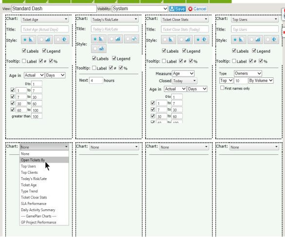
Once you've created your view, the charts will appear on your homepage. From within the charts, you can drill down into more detail. Click on the chart to see the options available:
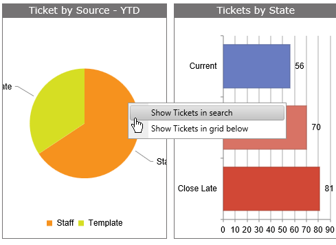
You can also click on a portion of the chart to drill down to the tickets for that particular area.


